Saul Bass (1920–1996) was an American graphic designer and filmmaker whose bold, minimalistic style redefined visual communication. Considered by many to be “the Pablo Picasso of commercial artists,” Bass spent over 50 years crafting images for Hollywood and Madison Avenue. His portfolio ranged from iconic film posters and motion-picture title sequences to corporate logos (e.g. AT&T, Quaker Oats, United Airlines, Girl Scouts) that remain in use today. In each medium Bass used simple shapes, dynamic typography, and clever visual metaphors – a timeless minimalism that made his work immediately recognizable. His legacy is pervasive: almost every striking movie title sequence or bold logo since the 1950s owes something to Saul Bass’s groundbreaking vision.
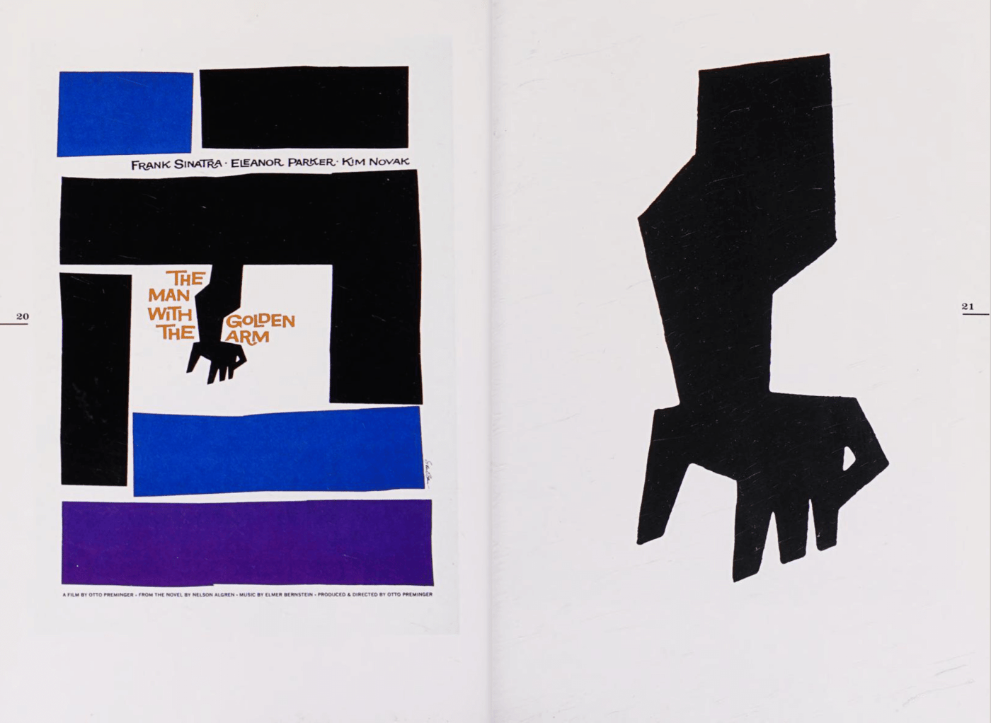
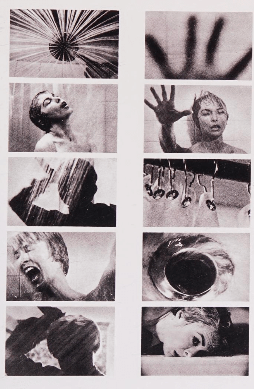
Bass revolutionized film title sequences, turning them from forgotten credits into miniature works which set the climate and context of the feature film. Before Bass, title screens were often static and ignored, but he insisted they “demand full attention” as part of the movie experience. Working first on The Man with the Golden Arm (1955) and later on Hitchcock thrillers like Psycho and Vertigo, he introduced kinetic typography and bold graphics to set tone and mood. For example, in Psycho (1960) Bass used simple parallel gray lines on black to underscore key elements of the film like the road, and Hitchcock's signature air of dread.

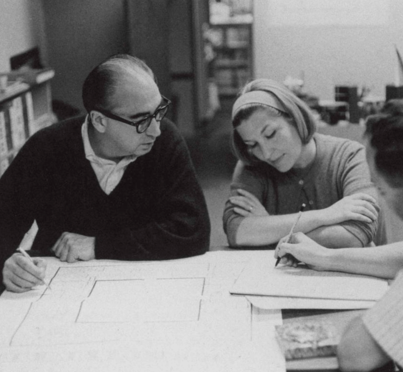
His wife and creative partner Elaine Bass joined the studio in the late 1950s and became co-director on sequences by the 1970s. Elaine’s influence is seen in the later titles’ added organic forms (the rippling water motif in Cape Fear) and more elaborate camera moves. In interviews Bass later acknowledged Elaine’s importance: “the only person that I completely trust in terms of her judgment”. Together (and sometimes credited as “Saul & Elaine Bass”) they crafted title sequences defined by clean geometry, hand-drawn lettering, and arresting simplicity.

Martin Scorsese worked with Saul and Elaine Bass on four films: Goodfellas, Cape Fear, The Age of Innocence, and Casino.

Scorsese: “It had been a dream of mine to work with Saul Bass ever since I tried to capture his style on my own imaginary movie titles that I drew at ages twelve and fifteen in a composition book I kept hidden at home. I feel very fortunate to have had that dream realized." [. . .] “His titles are not simply unimaginative identification tags , as in many films: rather, they are integral to the film as a whole. When his work comes up on the screen, the movie itself truly begins.”
Watch Bass On Titles (1977) on Eternal Family

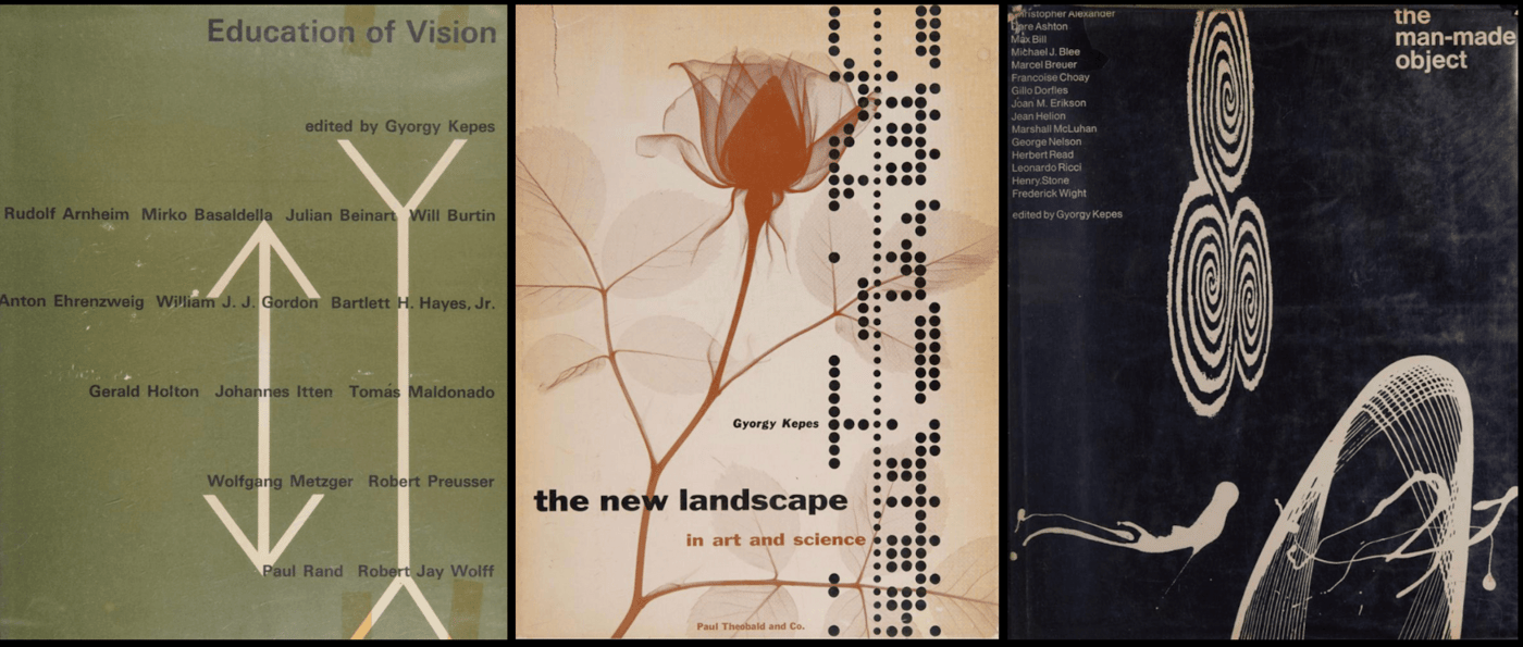
Early in his career, Bass absorbed modernist principles under mentor György Kepes at Brooklyn College. Kepes – a Bauhaus-trained artist and theorist – instilled in Bass a rigorous design philosophy. Under Kepes, Bass learned to view every image as a “creative act,” emphasizing balance, contrast, and the expressive power of lines and planes. Kepes even encouraged Bass to explore motion graphics long before Hollywood was interested in titles. These lessons shaped Bass’s later style: spare layouts with dramatic use of negative space, an interest in treatises on creativity and the popular arts, and a belief that audiences could be smarter than conventional advertising assumed. In Bass’s own words, he spent much of his career proving Kepes right about the forming process of images. The New Bauhaus-inspired clarity of his designs (whether logos or film art) can be traced directly to this training under Kepes and the modernist legacy.

In addition to film work, Bass made his mark in print advertising and branding. In the 1940s he started designing movie ads and posters (for films like Death of a Salesman and Champion), using his graphic economy to build intrigue. For example, his ad for Champion (1949) was called a breakthrough in film advertising. Bass believed filmgoers deserved sophisticated art rather than blatant hype, famously noting that U.S. movie advertising was generally “immature” and underestimates the audience.
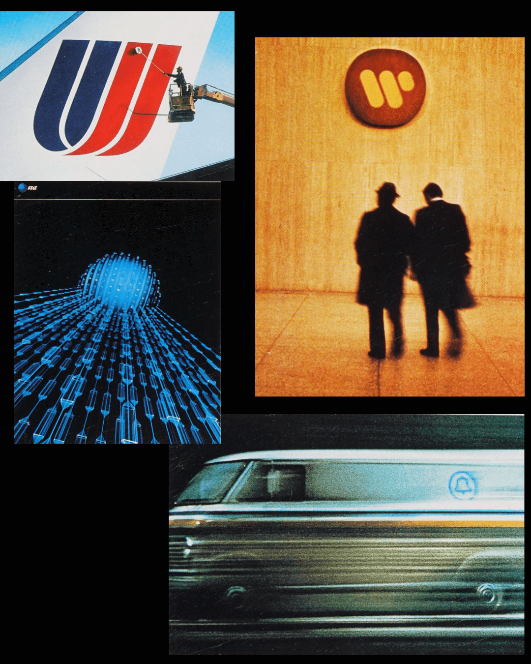
His posters usually avoided things like celebrity endorsements in favor of a strong single symbol or silhouette set against bold color fields. The same minimalist ethos carried over to corporate logos: during the 1960s–80s Bass & Associates crafted enduring identities for companies such as AT&T, Quaker Oats, United Airlines, Girl Scouts, Alcoa and more. These logos (often simple geometric shapes or clever abstractions) are still recognizable today. In all his commercial work, Bass “pared down ideas to their simplest form,” using clean typography and empty space to communicate instantly. As one design retrospective notes, Bass’s ads and posters put “everything you need to know” into a striking image with economy and wit.

Bass's career also extended to many influential moments in filmmaking. As a collaborator, Bass worked regularly with Alfred Hitchcock and Martin Scorsese, designing title sequences, posters, and sometimes storyboarding particular scenes. The iconic shower scene in Psycho was co-directed by Bass, as well as the final battle scene in Spartacus.

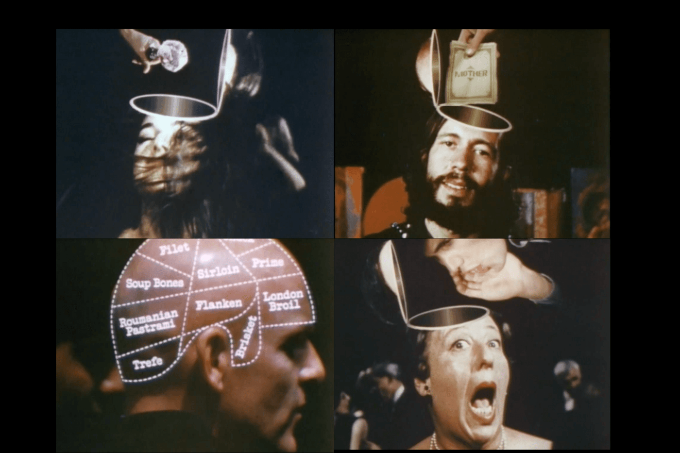
His most famous film is Why Man Creates (1968), a 30-minute experimental documentary short that won the Academy Award for Documentary Short Subject. Co-written with Mayo Simon, the film is structured in eight sections (titled The Edifice, Fooling Around, The Process, Judgment, A Parable, Digression, The Search, and The Mark), each exploring different aspects of creativity. Bass uses animation, live-action clips and visual metaphor to trace human invention from cave paintings to the atomic age.
One memorable segment, The Edifice, builds a tower of human achievement from the cave era to what appears to be the cloud. In general Bass combines low-fi animation (an ambitious ping-pong ball breaking free of a factory line) with evocative imagery (a mushroom cloud that morphs into a tree) to show both the “euphoria of the eureka moment” and the pitfalls of the creative impulse.
Ultimately Bass makes a philosophical point: creativity is how we leave our mark. In the concluding segment of the film, the narrator tells us: humans create to say “I am.”
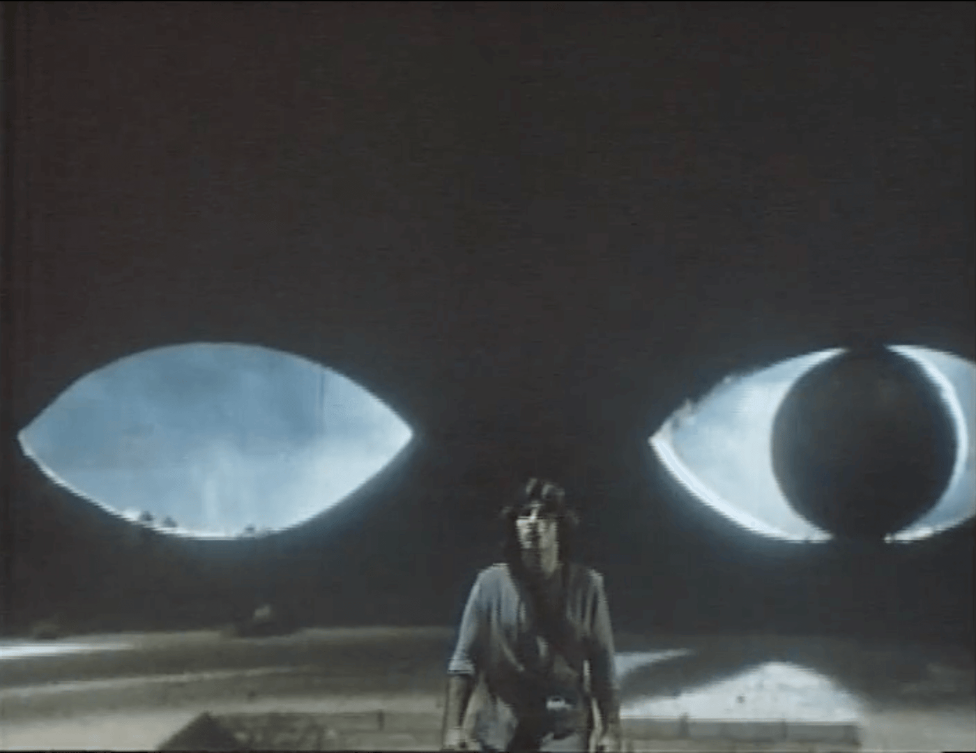
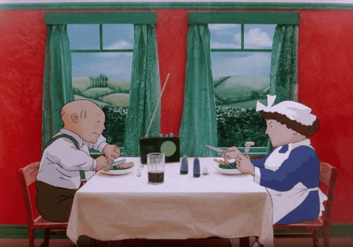
Late in his career Bass turned to narrative film. He co-directed Quest (1983) with Elaine Bass, adapting Ray Bradbury’s short story “Frost and Fire” into a sci-fi fable. Quest centers on a primitive tribe whose members live only eight days. In the opening, a newborn boy is marked as “the one” who must try to break this cycle – beyond their bleak valley lies a gate, and outside it people live for 20,000 days. The film’s narrative is driven largely by Bass’s design sensibility: the hero’s journey unfolds through striking, surreal visuals rather than dialogue. We see stylized landscapes that recall psychedelic album art, and mythic encounters along the way. Through pure form – caves, towering walls, the harsh sun – Bass uses composition and color to convey emotion and theme. The result is a highly visual, almost allegorical tale: the film’s look and staging illustrate Bradbury’s ideas about human limitation and the yearning to transcend it. While Quest remains a cult oddity, it showcases Saul Bass’s cinematic vision – design-driven storytelling that treats every frame as a graphic composition.

Saul Bass’s career reminds us that design is never just surface decoration—it’s a way of thinking, of distilling big ideas into clear, striking forms. Whether through a jagged line in a title sequence, a circle that became AT&T’s globe logo, or a short film that asked why humans create at all, Bass showed how minimal gestures could carry enormous weight. For design students today, his work is a blueprint for elegant image-making and conceptual clarity.

Written by Megan Switzer